My neighbor, being so sweet and laid back, pretty much gave me free rein. The only stipulation...wall color and furniture stayed. So I stopped by to assess the room and get an idea of what I was working with and how I was going to tackle this project. The room was so big and with THREE windows, the lighting was great. The color on the walls was very pretty...sort of a citron green...fresh and bright! Also, there was an abundance of furniture to pick and choose from. So, basically the "bones" of this project were in place, it just needed finishing touches.
I took a few pictures, then went home to think about how I was going to tackle this project. I broke it down into three areas that needed my attention.
1. Organization
As I said, the nursery had plenty of furniture...too much for one room, actually. So we started by clearing out an extra dresser, side table, and various knick knacks. We streamlined the room to a crib, changing table, bed, and trunk for the foot of the bed. This immediately opened the space. We also got rid of the comforter with dark, heavy colors.
 |
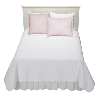
| Heavy colors in bed linens weighed down this space. They were traded in for a simple white coverlet and shams. |
 |
| Too much furniture! Small side table and lamp were removed. |
2. Color choices
 Now that I had a blank slate, I was able to start thinking about color options. We already had a bumper with a patchwork of soft colors and patterns. I "pulled out" the pink and white gingham pattern from the bumper and decided to repeat it in the crib skirt and euro shams on the bed. I found an almost exact replica of the fabric on a website called Fashion Fabrics Club for a mere $4 a yard, so I ordered 9 yards of the 1/4" gingham, enough to make two euro shams and a cribskirt.
  I also ordered plain white window treatments and a white coverlet for the bed from Target.
Let me tell you, these two items were a STEAL, and look so clean and fresh in the nursery. Because this nursery had a bright color choice on the wall and some pattern in the crib bedding, I wanted to keep the rest of the room simple. Target's Simply Chic line has some beautiful, inexpensive bedding that can really help a room come together.
3. Decorative accents
The icing on the cake for any room is the decorative accents. For this room I chose a few colorful pillows and three darling daisy hooks, all from Pottery Barn Kids. The hooks not only added a small pop of color, but also functionality. You always need a place for hanging towels and clothing.
We also added a large wall decal in hot pink. Did you notice that the bed did not have a headboard? The two large euro shams and wall decal serve the purpose by drawing your eye up and creating a background in lieu of a headboard. A large piece of artwork could have done the same thing. On the blank wall to the right of the bed we added a small collection of artwork....all created by Campbell's sisters! To unify the space I used white frames. It doesn't get much sweeter than this!
The reason I wrote this post is two-fold. I wanted to share this adorable little space which is now home to one of the cutest, sweetest babies ever. However, I also wanted to show you the three areas of a room that are often neglected - organization, color, and accents - and how you can remedy this problem. Later this summer I am going to launch a design workshop that will give more information on problem solving in these three areas.


No comments:
Post a Comment